The color scheme you’ll assemble for your brand will play a key role across your various marketing assets – from the way you create your own logo, to the design of your website, and much more.
To help your business stand out with the right brand colors, this complete guide covers everything from what the product colors are about, to the step-by-step process of choosing your own colors for local business. We also selected and analyzed 6 examples of effective product colors for inspiration.
How to choose your brand colors?
- Establish your brand identity
- Search for inspiration
- Pick your primary color
- Choose your secondary colors
- Select neutral colors
- Test your brand colors
What are brand colors?
Brand colors are a palette of around five to ten colors that are used to represent a certain company. A consistent and strategic application of brand colors can increase brand awareness and recognizability.
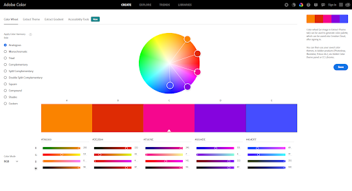
Some of the main applications of brand colors include a company’s logo, website color scheme, social media channels. To play with the colors we personally recommend testing out the adobe color wheel (https://color.adobe.com/) this gives a nice idea of combining the multiple colors together and gives an aesthetic sense while selecting the brand colors.

Establish your brand identity
The colors of your product are a reflection of your brand identity. So your color palette should match your values and the messages you want to convey.
For this purpose, you will first need to define the identity of your product. The recommended practice for this is to write a list of adjectives that describe your company’s character, as if you were talking about a person. Ask yourself how you would like the product to be viewed, and what makes it different from the competition.
Search for inspiration
As a final step before colouring your product, look around for color inspiration. Browse through your competitors’ pallets, and try to understand what makes them so effective. Think about what you can learn from their choice of colors, and how you can differentiate yourself from the competition.
Other great sources of inspiration are online color palette generators, where you can find interesting color pairing ideas and fun shades. You can also check out these logo color ideas to get some inspiration.
Pick your primary color
The primary color of your product, or primary color, is the one most closely associated with your product. Consider Tiffany’s Blue or Red Pinterest signature.
For your primary color, look for one color that best represents your business based on color definitions. You can check out the different shades and tints of
the color you have in mind, from green and black to soft and pastel, or light neon, to get the perfect look.
Choose your secondary colors
Once you have your primary color, pick two to four colors to go along with it. These colors will compliment your primary one and can either appear next to it or independently. A brand’s secondary colors can go in a few different directions.
Analogous color scheme:
These are close variants of your primary color. This means that if your primary color is bright red, you can add other warm colors (such as orange and yellow) that belong to the same color family. Analogous color schemes are usually harmonious and pleasant in their appearance.
Monochromatic color scheme:
These are different shades and tints of your primary color. For example, if your primary color is blue, your secondary colors can be light blue and dark blue. Monochromatic color schemes can strengthen and enhance your core color.
Select neutral colors
When selecting your product colors, it’s easy to focus on the main colors and ignore the neutral ones. However, neutral colors are important as they are the ones that hold most of your communication (like the color of your text) and will appear on the back of most of your assets. Neutral colors are usually white or black, often combined with a few shades of grey.

Test your brand colors
Once you have chosen your colors, put them all together and test them with a few different combinations to make sure they match and convey the message you intended.
To make your website accessible, you should also check your palette to make sure it is readable together